Visual Design (Roll 2): Fall 2009
My Visual Design class at Columbia gave me a couple rolls of film for an assignment. That first roll was pretty rough, but I think I did a little better on these shots from roll 2, though maybe it’s just due to the better lighting. Here’s the full second roll. 35mm slides, fall of 2009.
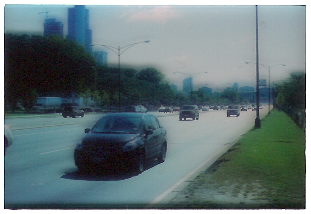
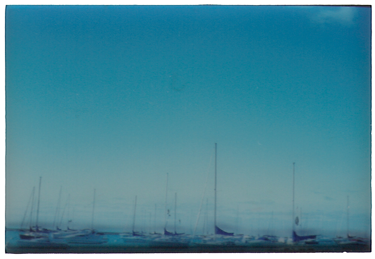
To say that these shots are better than roll 1 is a very low bar to pass. Roll 1 was half shot in shady dorm rooms where the light conditions weren’t suitable for this speed of film in the first place. So just going outside and focusing on real subjects was really all it took.
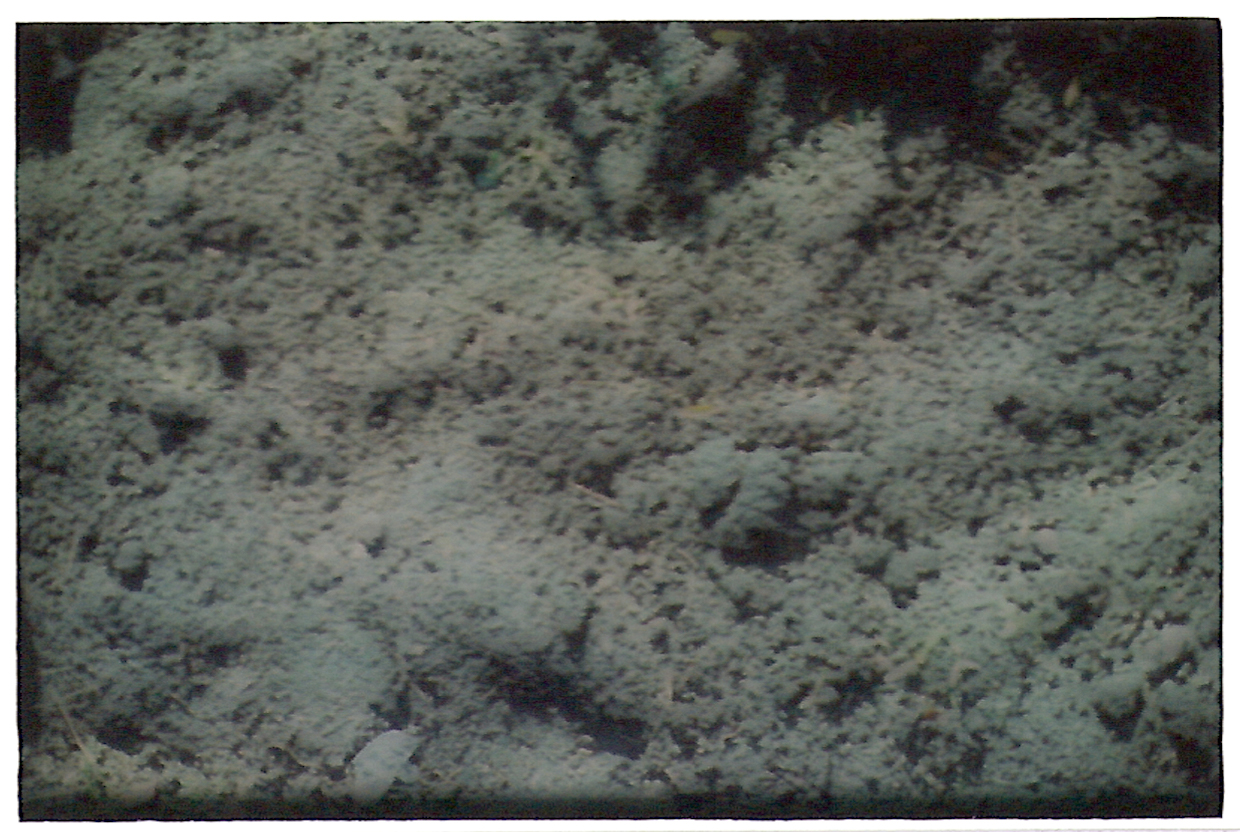
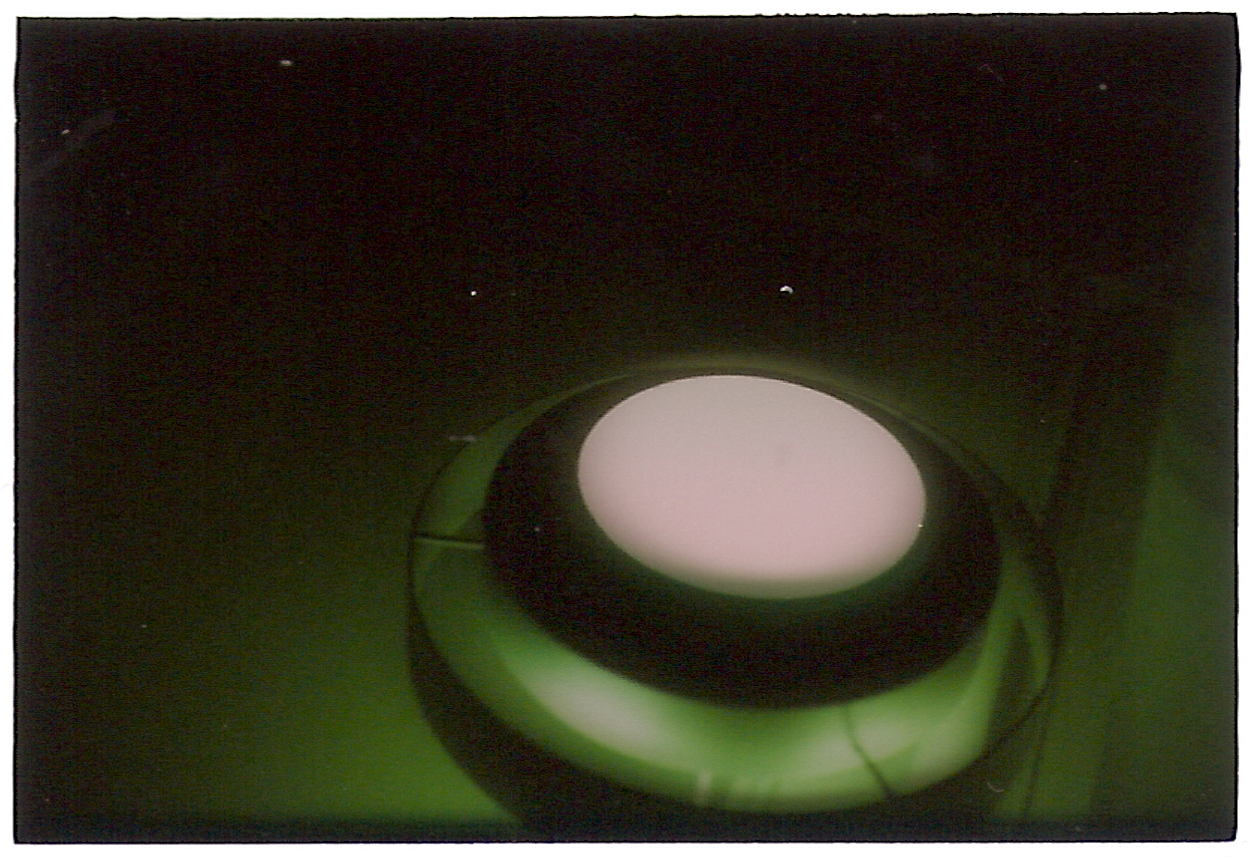
Still, I do like these better. And I think a lot of the blur and “flaws” in these images are due to the scanning process. Let’s explain that.
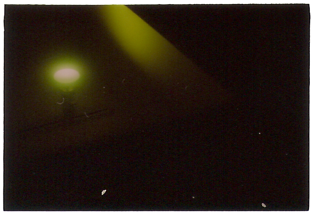
If you look at the borders of these images, they’re not just cropped edges, they’re rough black outlines. That’s because outside of the image is the actual slide frame, which is white plastic. It’s just that it’s so blown out for these (so you can see the slides correctly) that it shows up as pure white. But these are all actual, literal slides – translucent film bits in thicker plastic frames. (The frames aren’t THICK, but they’re thicker than the paper-thin film itself.)
So when these are scanned in, the film itself is technically a little bit removed from the surface, it’s not lying flush against the scanning platform, it’s elevated a bit due to the frame. So there’s a bit of shadow or shinethrough that gets picked up in these images as a result. That’s why they look a little “haunted.”
It wasn’t exactly intentional, but I love how it came out.
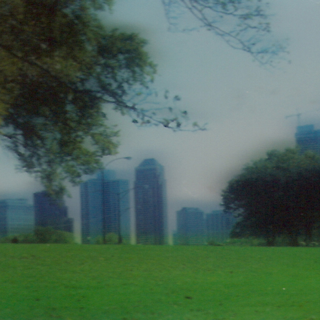
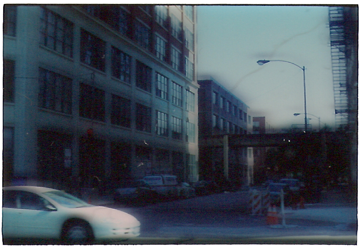
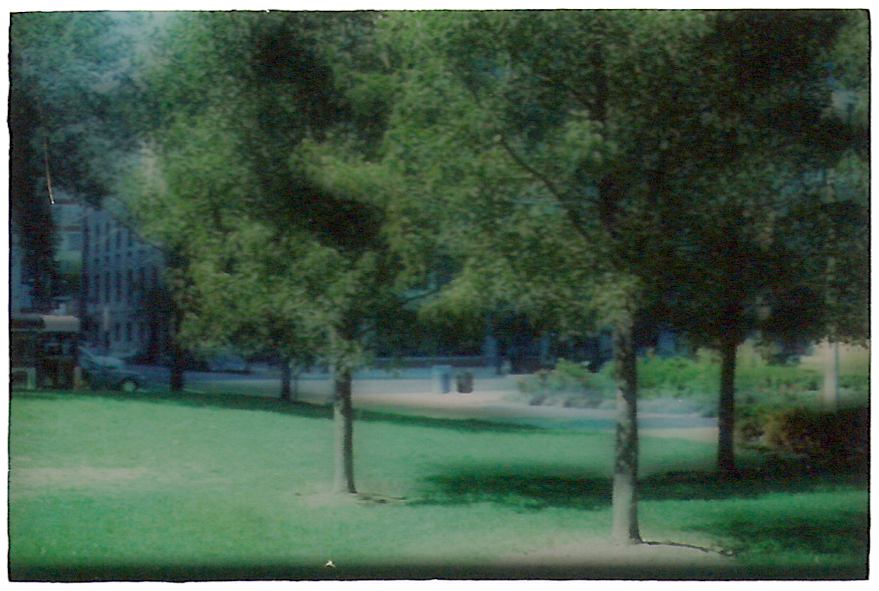
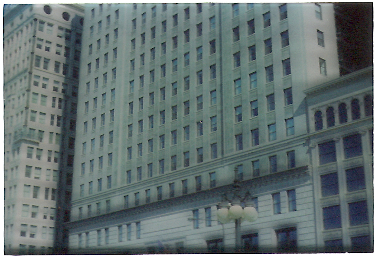
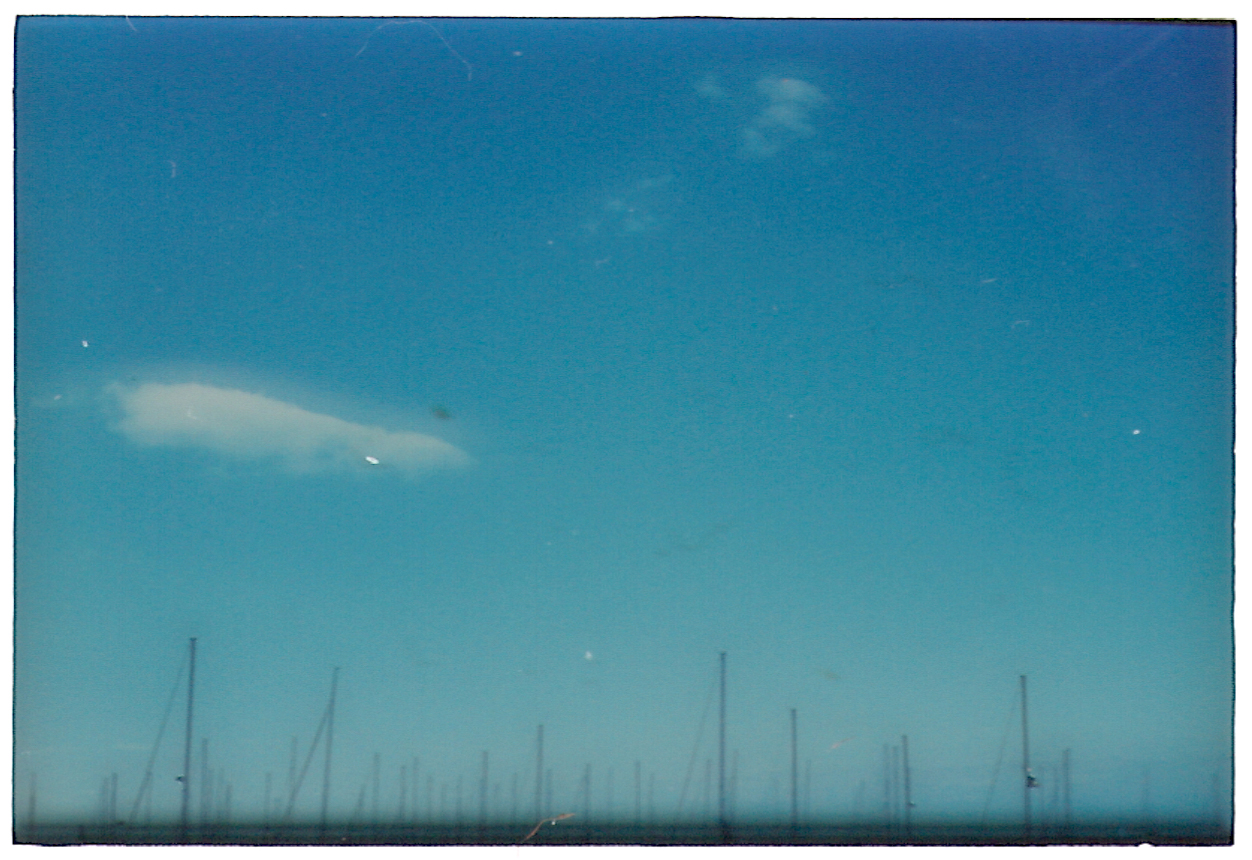
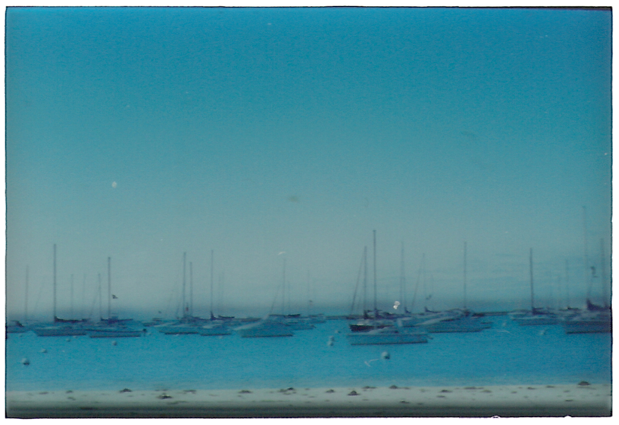
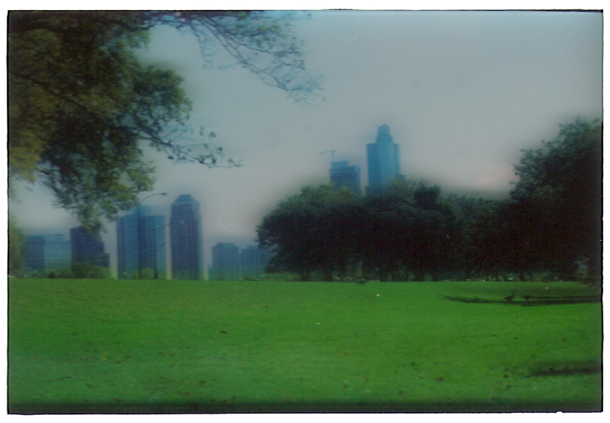
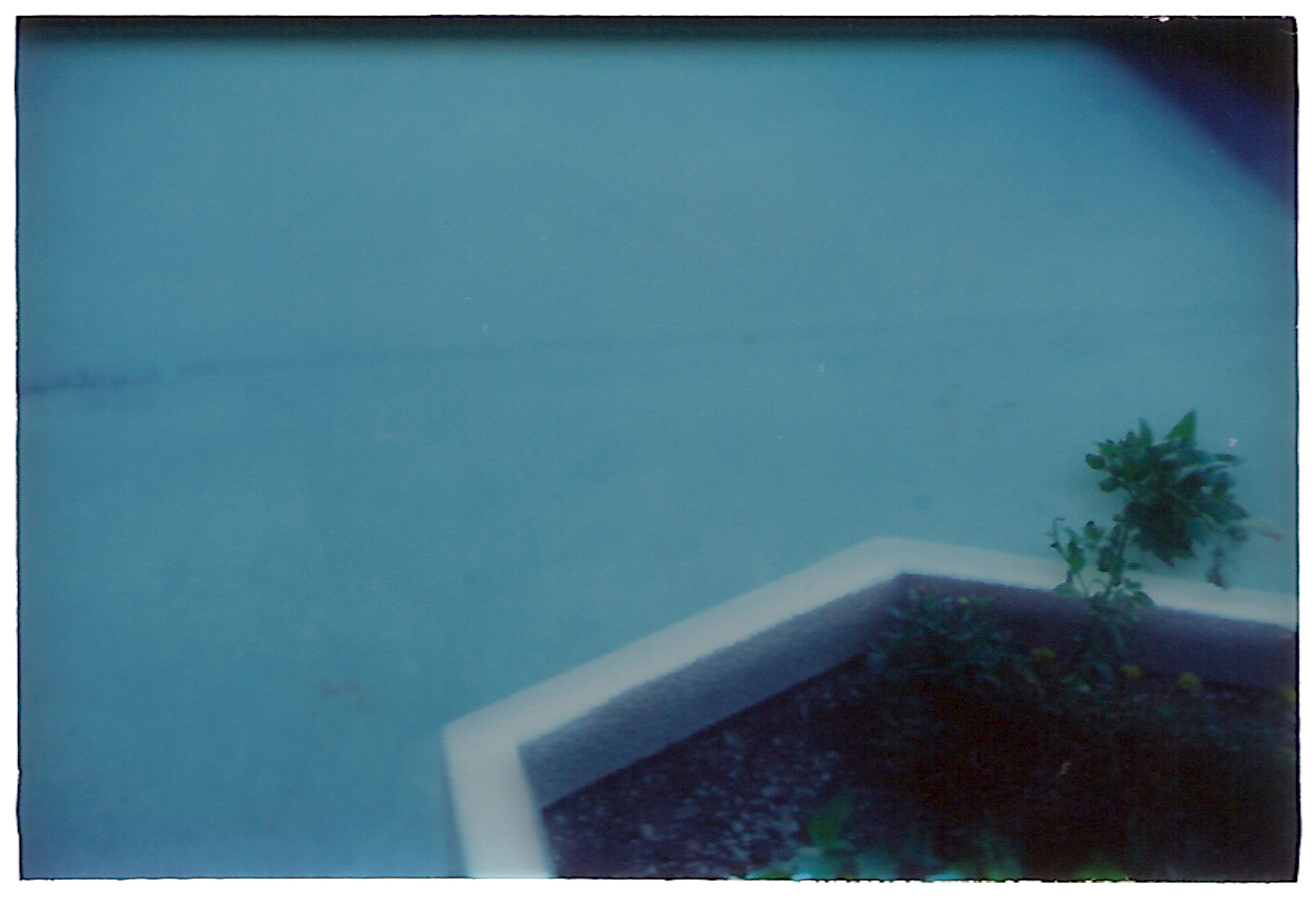
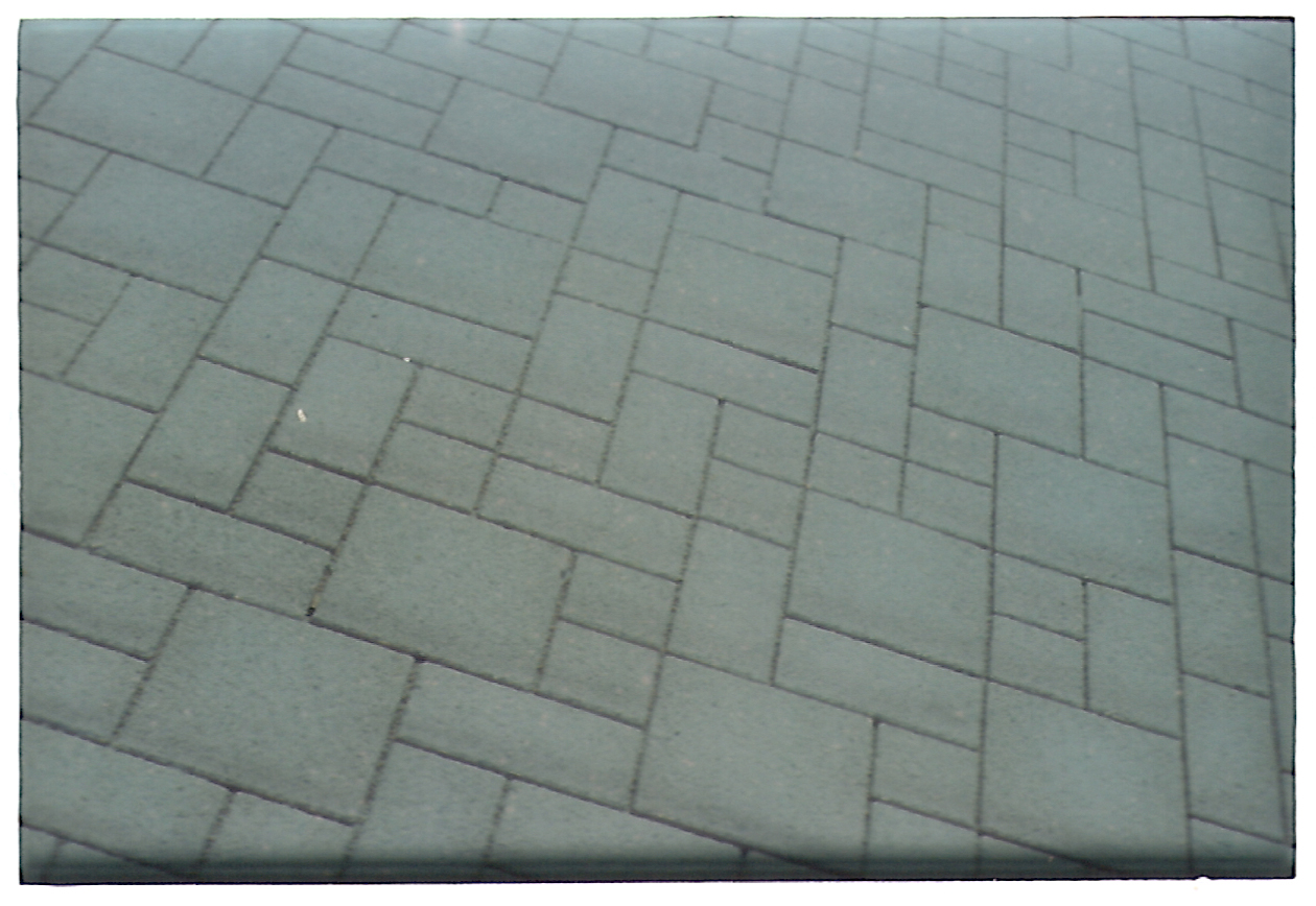
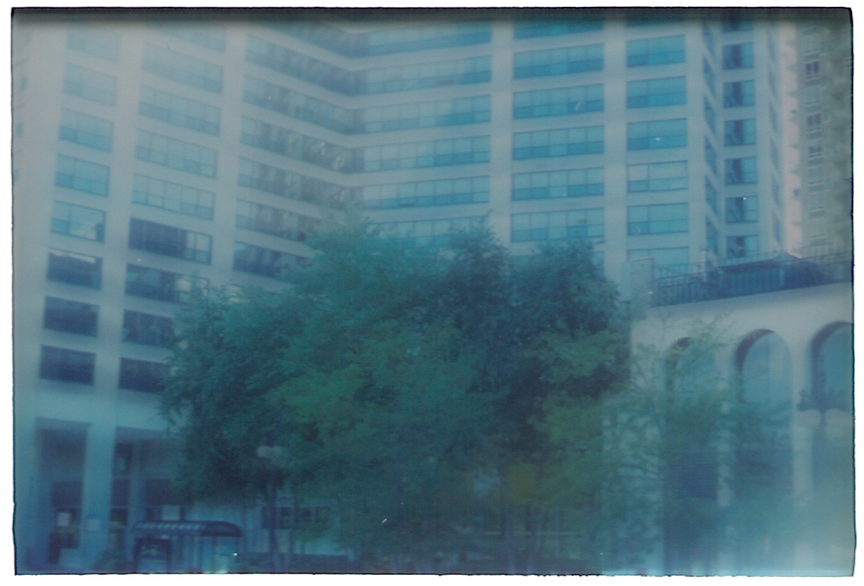
So although the subjects are all sort of boring–just more skyscrapers and trees and roadways in Chicago’s South Loop neighborhood around my college, oh boy!–the effect does at least add some interest. We can just say it’s on purpose!
Comments are closed.